Map Projections Explained: How Every World Map Distorts Reality
Every flat world map distorts the truth. That’s because the Earth is a sphere, and turning it into a rectangle is like trying to flatten an orange peel. Something always gets stretched, squished, or cut. In the context of geography, these compromises are called map projections, and they shape how we see the world, sometimes more than we realize.
We've compiled a definitive guide to understanding what map projections are, how they work, why they matter, and which ones are best for different purposes. Whether you're an educator, student, map collector, or just a curious traveler, we've got you covered.
What Is a Map Projection?
A map projection is a method for taking the surface of our round Earth and displaying it on a flat surface, like a map, poster, or screen. Because Earth is roughly sphere shaped, and we're attempting to 'project' an image of a 3D object onto a flat rectangle, there's inevitably going to be some distortion. Flattening it without distortion is in fact, impossible. Every projection comes with compromises.
Projections use geometry and mathematics to convert the globe’s three-dimensional coordinates (latitude and longitude) into two-dimensional coordinates (x and y). Each projection has its own goals, to preserve shape, area, distance, or direction, but it can never preserve all of them at once.
Why All Maps Distort Reality
No flat map can be perfect. When projecting the globe, you must choose what to distort and what to preserve. There are four major distortion types:
- Area: Are countries shown in their true relative size?
- Shape: Are the outlines of continents and borders accurate?
- Distance: Are distances between locations measured correctly?
- Direction: Are compass bearings preserved?
Some projections prioritize navigation, while others emphasize fairness or aesthetics. The intended use of the map is what informs the choice of projection in utilitarian cases. In casual reference situations, map viewers are often unaware exactly why some world maps look vastly different than others.
Common Map Projections
Mercator Projection
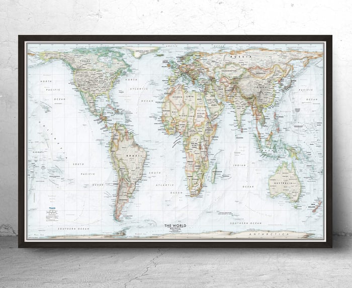
Created by Gerardus Mercator in 1569 for nautical navigation. It preserves accurate direction (rhumb lines appear straight), making it useful for sea travel. However, it grossly enlarges regions near the poles. Greenland appears the same size as Africa, though Africa is 14 times larger. Dispite being one of the most distorted, it is by far the most widely used map projection due to it's excellent navigational purposes.
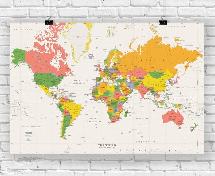
Gall-Peters Projection
Used interchangeably with the Gall Orthographic, this projection was designed in the 20th century to show true area and challenge Eurocentric worldviews. Countries near the equator appear larger than they do in Mercator, giving a more equitable global perspective. However, shapes are heavily distorted, especially near the poles.
Robinson Projection
Developed in the 1960s to create a visually pleasing balance of size and shape. It’s neither conformal nor equal-area, but serves as a compromise. This projection was once used by National Geographic.
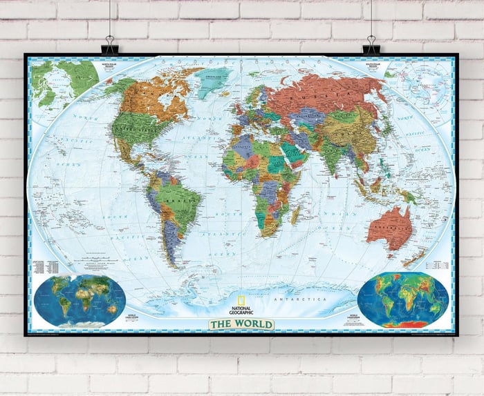
Winkel Tripel Projection
Currently used by National Geographic. Minimizes distortion in area, direction, and distance, making it one of the most balanced projections. "Tripel" refers to the three properties it compromises simultaneously.
Miller Cylindrical Projection
A modification of the Mercator projection developed in 1942. It reduces the severe distortion near the poles while preserving the familiar cylindrical look. It employs a distortion adjustment as you get closer to the poles to help keep countries looking proportionate. Often used in world maps intended for general reference.
Goode’s Homolosine Projection
Uses an interrupted layout to preserve area while reducing shape distortion. Often called the "orange peel" map for its segmented appearance. Great for visualizing land masses with minimal ocean distortion.
Mollweide Projection
An equal-area, elliptical projection. Excellent for thematic maps (like climate or population) where accurate area is crucial. Widely used in academia and international organizations.
Polar Projections (Azimuthal)
Show the Earth from a central point — typically one of the poles. Used in aviation, satellite imagery, and polar exploration. Preserves direction from the center point but heavily distorts distance and area as you move outward.
Oblique Mercator (Hotine) Projection
Used primarily for mapping regions with a diagonal orientation, such as Alaska’s panhandle or certain islands. It preserves shape along an oblique great circle, which makes it useful for narrow, slanted areas in geodetic and military applications.
Orthographic Projection
Simulates a satellite view from space. Great for visual appeal but not practical for measurement. Often used in globes and decorative maps, especially artistic renderings of Earth from space (the “big daddy” projection).
AuthaGraph Projection
A modern Japanese innovation designed to preserve area, shape, and proportion with minimal distortion. It divides the globe into triangles and unfolds it into a rectangle, keeping continents closer to their true scale and position. It’s praised for being one of the most accurate flat representations of Earth to date.
Equal Earth Projection
Designed in 2018 as an alternative to the Gall-Peters, the Equal Earth projection maintains equal-area properties while offering a more organic, less distorted shape for continents. It was created with visual clarity and fairness in mind, especially for educational use.
Sinusoidal Projection
An equal-area projection that maintains accurate areas across the map while distorting shape, especially near the edges. Often used in global data visualizations, such as rainfall and vegetation coverage.
Albers Equal-Area Conic Projection
Best suited for large landmasses that stretch more east-to-west, like the United States or Russia. It uses two standard parallels to minimize distortion between them, making it a favorite for statistical and government maps.
Examples of Maps Using Popular Projections
 Mercator Mercator | 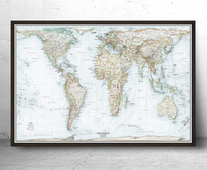 Gall-Peters Gall-Peters |  Robinson Robinson |
 Winkel-Tripel Winkel-Tripel | 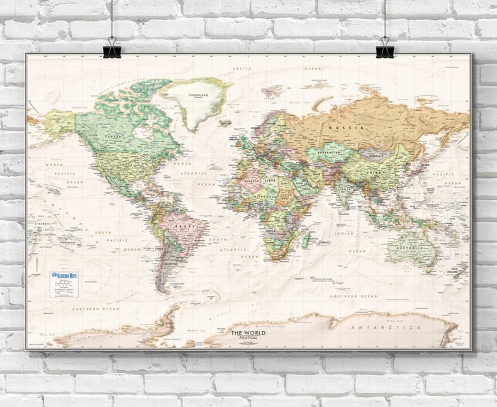 Miller Miller |  Equal Earth Equal Earth |
Side-by-Side Comparison of Projections
Have a look at the online tool TrueSizeOf.com that creates a visual of how the map projection distorts sizes.
Example comparison:
- Greenland (Mercator) ≈ Africa (Peters: 14x larger)
- Antarctica (Mercator): appears enormous; in Winkel Tripel: greatly reduced
- South America (Robinson): relatively balanced vs. stretched in Peters
Why Map Projections Matter
Map projections shape our understanding of the world. When a projection distorts the size or position of countries, it can impact our perceptions of power, importance, and geography itself.
Mercator, long favored by textbooks, gives undue visual prominence to Europe and North America. Gall-Peters, on the other hand, attempts to restore proportional equality, a reason it's favored by educators and advocates for global awareness.
Projections affect:
- Education and curriculum design
- International politics
- Global development and aid
- Data visualization in climate and economics
What’s the Best Map Projection?
The best projection depends on what you’re trying to achieve. There’s no universal “best,” but there are better choices depending on the use case.
| Purpose | Recommended Projection |
|---|---|
| Navigation | Mercator |
| Equal area representation | Gall-Peters, Mollweide |
| Classroom/world reference | Winkel Tripel, Robinson |
| Polar or flight planning | Azimuthal Equidistant |
| Satellite-style globe view | Orthographic |
| Thematic or data visualization | Mollweide, Equal Earth |
Projections in Google Maps & Media
Despite its flaws, Mercator remains the default projection for Google Maps. Why?
- Straight lines = constant compass direction (great for routing)
- Scalable at multiple zoom levels
- Familiar layout, even if it misrepresents sizes
But many modern outlets and textbooks now prefer Winkel Tripel or other equal-area projections for fairness and realism. Many consider Mercator projection to be antiquated for use in wall maps and instructional materials, due to the implied bias created by diminishing the size of Africa and equatorial regions.
Frequently Asked Questions
- What’s the most accurate world map?
- No projection is perfectly accurate, but Winkel Tripel and Equal Earth are balanced for general use.
- Why does Greenland look so big?
- Mercator distorts areas near the poles, inflating land masses like Greenland and Antarctica.
- Is the Gall-Peters projection better than Mercator?
- It depends, Gall-Peters shows true area but distorts shapes; Mercator preserves shape locally but distorts area.
- Why not just use a globe?
- Globes are accurate but not practical for wall display, zooming, or thematic overlays.